The Maldives has been officially rebranded with a new marketing slogan, ‘always natural’, and a fingerprint logo consisting of islands, corals, turtles, sharks and herons that transitions from blue to green.
The objective, said CEO David Keen of agency Quo, was to create a brand “in which Maldivians around the world can be proud.”
Speaking at the unveiling of the rebranding at the The Maldives Marketing and PR Corporation (MMPRC) today, Keen said the brand “should talk to the Maldivian people, about industry, sustainability and environmental challenges and successes the Maldives has had.”
“The slogan ‘always natural’ emphasises the huge influence the natural world has on the Maldives,” Keen added.
The new logo and slogan replace the Maldives’ existing 11 year-old branding, ‘The Sunny Side of Life’.
“The old tag line was more targeted towards the tourism industry,” said State Minister for Tourism, Thoyyib Mohamed Waheed, explaining that the new branding broadened the brand to attract investment in industries such as energy and fisheries.

“The last slogan was great for the European market,” added Managing Director of the MMPRC, Simon Hawkins, as visitors from countries such as the UK considered the sun a key drawcard. “But the number one market is now the Chinese, who don’t like the sun [as much]. We have to adapt to the market.”
Keen noted that the broader national branding would allow cross-marketing opportunities, such as stamping the logo on Maldivian products such as tins of tuna.
“A can of Maldivian tuna sold in Marks&Spencer or Waitrose is reaching exactly the market we need to reach for tourism,” added Hawkins.
The new branding was approved by the Cabinet today.
The Tourism Ministry has meanwhile published figures revealing an almost 15 percent increase in tourist arrivals in September 2011, compared to the previous year, and a 17.7 percent increase in arrivals for the first nine months of the year.
Tourist arrivals from traditional European tourism markets for the Maldives dropped in September, including the UK (10.3 percent) and Italty (16.6 percent). Chinese arrivals meanwhile increase 54 percent.
Visitors stayed an average seven nights in the country’s 24,480 beds, while the average occupancy rate was 71.5 percent across the country.
 (0)Dislikes
 (0)
(0)Related Posts
 MMPRC targets social media push to bolster online presence
 Maldives considering reverting to “sunny side of life” branding
 Maldives reverts to ‘Sunny side of life’ branding, targets one million tourist arrivals for 2012
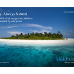 MMPRC releases billboard ‘mock-ups’ of new Maldives branding
 MMPRC believes Thumburi project will bring an additional 150,000 tourists per year
 MMPRC to host UK journalists in October
Ref link to Simon - he got permission to do this with the author, but that reply was not communicated by the website that published it - what does that tell you??
As for the rest of the twisted comments here, this really sums up the characters involved here!
Was a change needed? - Yes. 'Sunny side of life' was cheesy, tired and pedstrian. It looked like it was promoting some down-market Spanish holiday camp. Also, it certainly didn't have any appeal to industries outside of Tourism which is a key objective and a sensible one at that.
Was this the best possible revision? - Maybe not. But then, government agencies can never be as edgy and creative as a company like Apple because they are a lightning rod for criticism (witness all the comments here). As a result, government marketing has to be broadly acceptable and unobjectionable and not wildly ambitious. Furthermore, its broad remit (Tourism + Industry) makes it hard to be too focused.
What I like about the logo (contrary to some opinions expressed here) is the colours. One thing that is a truly distinctive feature of the Maldives is the various shades of blue in the aquatic tapestry that blankets the islands. The logo colouring really nails this superbly and subtly (contrary to the garish and dated style of the predecessor)
Now that I think about it I think I get what it's supposed to represent.
The change in gradient from blue to green symbolizes going green and the fingerprint made of wildlife probably represents the carbon footprint of the country. It's all climate related in other words and goes along with what Anni is doing these days.
Not that bad a concept but I still don't think it's anywhere near as good as the previous one which was about as perfect a brand gets. Take the new font for instance which happens to be a freely available one. When you pay as much as $100K for a custom brand, the designer should at least come up with a custom typeface.
The positioning of the slogan doesn't look very good and the slogan itself doesn't make that much sense either. There are hundreds of other destinations where the word 'natural' would fit their description much better compared to Maldives which is becoming more and more artificial by the day with all the lagoon dredging and the artificial beaches, artificial sea barriers & reefs and things such as the planned artificial golf island or the new reclaimed island being developed near Male'. To me, 'Always Natural' almost sounds like a campaign against breast enhancement or an advertisement for a herbal remedy or a food production company.
There are also issues with usability if you think about it. It's not very scalable at all and when you use a grayscale version of it as a letterhead, it would be hard to even make out what exactly the fingerprint is and it would end up looking like something related to crime investigation. With the increasing crime rates in the country, it's a nice coincidence perhaps.
/rant over
I dont know. Liked the sunny side of life better.
On the bright side, at least it's not as bad as the PPM logo?
wow! it was always going to be impossible to please everyone. Oh get off it everyone the logo is pretty good. And yes people have seen seahorses here...i haven't seen a whale shark ever myself, but i do believe it exists in the Maldivian waters. The tag line is also not that bad, as like everything this will need some getting used to , i can remember how we all slagged off sunny side of life first, and how tourists would come and scream at the reception when it started raining.
Kekekekekkeke three or four lousy self proclaimed 'designers' going off through their ears just because they didn't get the opportunity to copy paste and call it an original! Why didn't you shameless twits scream out the way you're doing now when your now favourite "sunny side of life" came out? but ofcourse you were scared shit out of your pants, weren't you? kekekekeke because you knew we then had the world's most remorseless dictator with a crocodile smile watching you and making your live the darkest life ever. kekekekkee. though I have to admit that a few hints of pink, orange& yellow would make this one a bit lively and attractive.
Maldives is entitled to a much better logo and tagline than this one...
The logo design was copied or of course looks like the design of ocean conservancy by coincidence.
The Tagline is substandard as far as I'm concerned. As a Maldivian I feel ashamed to be associated with this logo.
This does not look like a logo of an upmarket tourist destination. Maybe it was time to change "the sunny side of life" but definitely not with this rubbish. Simon may I ask, from where do you get your numbers, when you say Chinese market is our No.1 market. You are distorting the facts, check the room nights and see which is our no.1 market. Then take western europe, which has been and always will be the bread and butter of our tourism industry and compare the figures.
could have done much better than that!
Much better, the change was necessary. What the consumer thinks is what matters.
its not that bad. i was told by an insider that the consultation process involved many from the tourism industry and it included mati, matato maleeh, and some mmprc board members. they could have check it properly before going public.
You need to say 'Always natural' if you want to dispel a preconceived notion that Maldives is not natural. If such a notion does not exit, why do u need to reaffirm the naturalness of Maldives.
By saying 'always natural', you are really CREATING A DOUBT of whether Maldives is natural in the first place.
Its like saying Fresh water - just to assure that water is not dirty.
Terrible choice.
...it's unprofessional and cheap. It reflects nothing about Maldives.
Its a shame to lawmakers who have bypassed the artistic talent so much in abundance in Maldives.
As CNN puts it, 'modern slavery'. And sure it is as the government keeps running outsourcing expertise just because...........
Shame on you...what a waste of taxpayers!
Much better, looks great when working in context. The Maldivian committee made this decision, not KEEN I am told..
Sunny Side of Life was a cheap slogan, aimed at two things: 1. 'bucket and spade' holidaymakers who used to come here to cheap resorts back in the day; and 2) an attempt by the Gayoom regime to make the country sound happy and nice when they were busy butchering political opponents in jail.
I like the emphasis on nature because that is why anyone comes here: sunsets, beaches, palm trees, lagoons, reefs, water etc.
just checked the logo of Ocean Conservancy. This is really cut and paste work of a primary student tryng to finish his assignment. And to think our Government paid $100K of taxpayers money.. what a shame.... should have opened it up for our local talent and i am sure we would have got a far better "ORIGINAL" tagline and logo.. wonder how much the poor sod who plagiarized it actually got... money would have passed thru many hands...
this clearly show that MMPRC does not have the capacity to do this kind of excersize. Simon initially had the idea of rebrading by just chnaging teh logo from his letter head and website ? This is how far he can think of ? he has no knowldg on marketing or PR but still he is the boss for promoting our country ? We became the number one tourist destaination by Maldidivian in the hot seat to do marketing and promotion not some white guy from UK who has no quilification.
They did open it up to he locals, the whole world as well in a competition, and even the school kids. The committe consisting of MATATO, MATI and MOTAC and stakeholders did this, all Maldivians with good intentions...
Better than he last slogan and ice cream logo!
He has over 22 years London media experience and he has only ever worked in media actually..
So we are rebranding mostly for a single market, which is still at the fledgling stage? talk about putting all the eggs in one basket! Most Chinese want their skin to be as white as they can make it...probably would swim underneath umbrellas if they can... But people who don't like the "sun" should not come to Maldives, an equatorial country. Its like going to the Swiss Alps & not liking snow.
i actually think the previous logo is much better...but if MMPRC did want a change to encompass the other industries & carbon neutrality etc, sure, go for it! But couldn't they have come up with a better logo? like some have mentioned, it does look more suited to wind/weather field than the branding of a whole country.
to my knowledge, when creating a logo, (as someone has mentioned above as well), you have to:
1. create a symbol which will make people at least marginally get what the brand is all about - we can't include the meaning of the logo every time we use it
2. make it interesting, original & honest - the slogan is misleading...the beach & sea is natural but the resorts are man-made & the products offered are mostly imported
3. Use things in a way that the viewer does not have to use a magnifying glass.
4. it should also look good in small scale & gray scale.
I thought this government wanted to promote Maldivian talent etc...then why does a foreign company get such a huge amount for creating a lousy logo (which strongly resembles another logo) that i'm sure even amateur graphics designers in Maldives can easily make for less than 15,000? We have such talented artists here, why not use one of them? If the question is about a whole campaign, might i mention, MMPRC is supposed to do that? we have Maldivian companies that can do the deed as well...