The Maldives has been officially rebranded with a new marketing slogan, ‘always natural’, and a fingerprint logo consisting of islands, corals, turtles, sharks and herons that transitions from blue to green.
The objective, said CEO David Keen of agency Quo, was to create a brand “in which Maldivians around the world can be proud.”
Speaking at the unveiling of the rebranding at the The Maldives Marketing and PR Corporation (MMPRC) today, Keen said the brand “should talk to the Maldivian people, about industry, sustainability and environmental challenges and successes the Maldives has had.”
“The slogan ‘always natural’ emphasises the huge influence the natural world has on the Maldives,” Keen added.
The new logo and slogan replace the Maldives’ existing 11 year-old branding, ‘The Sunny Side of Life’.
“The old tag line was more targeted towards the tourism industry,” said State Minister for Tourism, Thoyyib Mohamed Waheed, explaining that the new branding broadened the brand to attract investment in industries such as energy and fisheries.

“The last slogan was great for the European market,” added Managing Director of the MMPRC, Simon Hawkins, as visitors from countries such as the UK considered the sun a key drawcard. “But the number one market is now the Chinese, who don’t like the sun [as much]. We have to adapt to the market.”
Keen noted that the broader national branding would allow cross-marketing opportunities, such as stamping the logo on Maldivian products such as tins of tuna.
“A can of Maldivian tuna sold in Marks&Spencer or Waitrose is reaching exactly the market we need to reach for tourism,” added Hawkins.
The new branding was approved by the Cabinet today.
The Tourism Ministry has meanwhile published figures revealing an almost 15 percent increase in tourist arrivals in September 2011, compared to the previous year, and a 17.7 percent increase in arrivals for the first nine months of the year.
Tourist arrivals from traditional European tourism markets for the Maldives dropped in September, including the UK (10.3 percent) and Italty (16.6 percent). Chinese arrivals meanwhile increase 54 percent.
Visitors stayed an average seven nights in the country’s 24,480 beds, while the average occupancy rate was 71.5 percent across the country.
 (0)Dislikes
 (0)
(0)Related Posts
 MMPRC targets social media push to bolster online presence
 Maldives considering reverting to “sunny side of life” branding
 Maldives reverts to ‘Sunny side of life’ branding, targets one million tourist arrivals for 2012
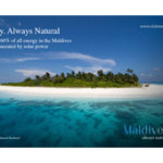 MMPRC releases billboard ‘mock-ups’ of new Maldives branding
 MMPRC believes Thumburi project will bring an additional 150,000 tourists per year
 MMPRC to host UK journalists in October
I didn't know the Maldives was a company...
If the Chinese don't like the sun why are they coming, that's about the dumbest answer I ever heard for a guy making tons of money for coming up with two words.
This was just an excuse for people to stamp their own authority on something that was perfectly good anyway.
You don't see Coke suddenly becoming the 'Unreal Thing' or Dhiraagu saying 'It's difficult Dho'
Just as well we have nothing else to spend our billions on like the odd hospital or college!
We make our money on the facade created by people from elsewhere mainly anyway. What is natural about a falsely manicured island built with timber from Sri Lanka and Indonesia, staffed mainly from everywhere but Maldives. They serve food imported from who knows where and just about every thing you can mention is false even the desalinated bottled water, often from other countries too.
Of course there is nothing wrong with any of that until you describe it as 'always natural' which is in fact simply not true.
Sorry but I am proud to live in and follow 'The Sunny Side of Life' which in my opinion was an honest description of the country I live in and love deeply.
Are the foods organic? are resorts buit using local material if not brought from china. and how natural is the concrete Male with no trees and it's signature artificial beach
the logo theme does not sound sincere. besides why is there a need for a new theme if the previous one is working well. this looks like a scam that needs to be investigated
Ugly looking logo / colours and typography. The previous one (although a copy of many) looked good and suited us.
And ... it used to be natural. It's a lot of concrete now.
alwaysnatural.com is some one's logo already.
The company could sue Maldives for copying their theme
Aslo a question - could any woman brand herself as a 100 percent virgin
So sad, so serious, so cold : cool for frozen fish, simply out for an holidays country.
Please, change agency !
leaked ad from the MMPRC for this campaign!!
http://a6.sphotos.ak.fbcdn.net/hphotos-ak-ash4/312210_100347940078531_100003099751704_1876_89873028_n.jpg
Havnt these guys heard of the sayin "if it aint broke, dont fix it". The logo and slogan we have been using all these years was perfect! n way better than this common sounding slogan that they have come up wit after probably spending a huge amount for a foreign ad agency!
Looks the same as the logo on the renewable energy ad on the righthand side.
Who are we marketing the country to? A bunch of scientists at the International Panel on Climate Change? Wind energy investors?
Come to think of it, would make a good logo for a sanitary pad, don't you think?
I thought going natural wasn't allowed in the Maldives. But what do I know? we are now markting ourselves as a nudist colony. Brilliant. Can the locals join, or is it haraam for us?
The dubious nature of the slogan aside, this is just a horrible logo. This looks as if someone spent almost a whole minute laboring over this in Photoshop. Must use gradients!
This is fine for a conference on marine research.
'A huge influence the natural world has on Maldives?'
Has the rest of the world gone up to live in floating cities?
Terrible change and it's going to look even worse in black and white. The previous one really was one of the best tourism marketing brands in the world. Hope some other country doesn't adapt the slogan as their own now.
the later sure lack the vibrancy of the previous Logo. But the catch phrase isnt bad.
I am somewhat surprised of the choice of colours
Superb, in touch with the market today and more importantly tomorrow. We love it!
what a stupid idea....thats the most ugly logo ive ever seen...doesnt fit to Maldives....kommeves dhon meehakah laarigandeh dheefa kuruvaafa oi kameh mee...eggothakah ves mee raaje promote kuran kuraa kameh noon...kihaa bodu balaaeh mee...
Genius stroke to link the tuna market and tourism brand for the same marketing goal. Huge improvement all round!! In touch with today.
always natural my ass, Maldives is a parasite 100 depend on unnatural products.
Love the logo, not so sure about the tag line. But yes Sunny side of life had to go, it no longer fit the Maldivian tourism product, plus it brought images of just lying in the sun doing nothing. Which is a dying trend in the tourism industry.
Change is always difficult for some. But change is necessary and should be welcomed.
Keen Media and Simon...Well done...you proved we Maldivians are seriously stupid!
where did the sea horse in the logo come from ! thats not something which lives in our seas , only can be seen rarely as it can drift . Not natural in many ways.
The Sunny Side of Life , is so perfect , who gives up on something when its perfect ?
i guess some big guy from our government needed to make some more money with maldivesalwaysnatural.com so had a great plan to make Countries main slogan for the major industry changes to it , which was available for them.
great work keep it up , try make a million now. !
This comment has been removed as it contravenes articles 2 and 6 of our commenting guidelines. - Minivan News team
Just because Maumoon has done something doesnt mean Anni has to change it..change the stuff that needs to be changed.and what he (maumoon) has done wrong...
Why get a foreign agency to do this work when there are so many creative individuals in Maldives...who are more in touch with the country....
I thought it was supposed to be a tourism promotion logo/slogan not brand for the whole country....
on the note abt occupancy being low from Europeans....they are going through a crisis....they will spring back up....and the chinese market is just an emerging market and Maldives doesnt have to lose anything to take over that market...
HORRIBLE LOGO AND SLOGAN!
TYPOGRAPHY
The typography looks very formal and in this context too weak or shall i say predictable. it is almost as if an amateur designer used an available font on his computer, typed Maldives, did what was expected with the tagline (to place it to the right bottom hand corner.
And then using photoshop gradient, added a small color gradient to the text.
There is no originality or "standing out" factor for this font. it is bordering on careless and lack of effort.
PICTORIAL LOGO
If this article hadn't mentioned the logo was inspired by a finger print, i wouldn't have made the connection. Thats the first problem with this logo.
Secondly, the size of the logo seriously compromises the application of the symbolic messages in various media. Imagine this logo being printed on an A4 letterhead, or envelope, even a brochure. You would seriously need to size it big or a magnifying glass in order for the viewer to see all the elements (the shark, the sea horse and whatever is in the inner circles)
LOGIC
The article mentions something about people not wanting the sun always. I think the "sun" as a central theme is still a far stronger argument than being "natural". Natural is such a wide term - the himalaya mountains, a water fall, an old tree are all natural phenomenons - but it does not relate or home in on what is unique about this destination! The "sun" at least does that because people come to Maldives to enjoy the beach and its islands in the sun.
The sunny side of life tagline had a double ring to it because sunny could have meant happy or the heat from the sun. So, it was bait clever in the sense. and not as flat and boring as Always Natural!!!
I can't agree with the MD of MNPRC when he claims the sun is only for the europeans. How "off" can that statement be. i don't think the chinese or any other tourism for that matter are coming here to remake Gene kelly's "I'm singing in the rain" on a tropical beach.
KEEN MEDIA
I am surprised to find that David Keen, one of the gurus of hospitality marketing has got this one bit off the kilter. I am not too surprised about this Simon fella, from the comments here, i don't think he has proved himself worthy to be in this post. Apologies sir.
CABINET DECISION
I also do not think the cabinet is the right forum to make a decision on a logo. i don't know whether any focus group discussions amongst various stakeholders (industry experts, tourists from various countries, maldivians) have been done before unveiling this logo. I think if some of these type of restricted exposure and testing was done, we wouldn't have got to this and instead of all the criticism, would have been able to WOW! the audience whoever they may be.
Right now, there is no WOW! thats nice! thats so cool! its not sexy, its not like seeing an iPhone for the first time, instead what i am seeing is the first generation of a nokia color screened phone!
WTF! What is NATURAL about Maldives?
Do a poll and see how many Maldivians have seen a seahorse or a crane!
What a hideous logo! Yikeeeeees!!!!!
Ridiculous slogan, clearly they are trying to dupe the international community in getting more money for their bullshit carbon neutral 2020 scam. Sunny side of life was perfect slogan, they should have just changed or updated the logo a bit
I think the LOGO would have been perfect had we added a sea-cucumber, an octopus, a prawn, a lobster, a crab and also a bit of a shark fin.
Chinese people would love seeing it and I am sure our arrivals would triple and soon all the new islands that are waiting for investments can also have tents on the beach to cater for this unexpected growth in demand.
'Always Natural' is a total and complete lie. I think this slogan should not be used.
When someone says 'always natural' it gives me the impression that everything is natural here in Maldives and that it is natural at all times. But this is nothing close to the case.
We do not have 100 percent natural products, nor are we doing things the natural way 100 percent of the time. Some resorts may be more eco-friendly as compared to others. But none of them is 100 percent natural. So to say 'always natural' is a broad sweeping LIE which no sane person should promote as a slogan.
I am fearful that we might be sued for giving this 100 percent false impression. And I am angry that people are deliberately dumbing down our society.
This is sabotage ! KEEN is doin this on purpose im sure! design wise this is not good at all.. not giving the msg we Maldivians want to show im pretty sure.
And what a copy of the logo design and concept http://www.oceanconservancy.org/
We have creative people in Maldives (e.g. MooInc, Think) and they can do 1000 times better than this sorry of a branding!!! tsk tsk tsk. Maizan Asif where are you?...didnt you say anything; you have access to MMPPRC and you let this happen. sigh!
as one of the comments above says ' I don’t why we are still enchanted by colonialism'
why can't a Maldivian be given the task so that at the VERY LEAST there would be some one to take responsibility for theses things. foreigners (british) are now running the country and making all decisions.
when the shit hits the fan, you will not find any of them and the country would be in a mess
This Simon Hawkins is a friend of David Hardingham. He was first employed by Minivan News. Later he got the job from The Maldives Marketing and PR Corporation. Minivan News should do some background check and see if he has any experience in hospitality marketing. The European tourists are not coming because of a recession. The Chinese tourists are coming because their economy is good. Next year, if the Chinese economy goes down should we go for another expensive rebranding? The logo is a copy. How much did it cost in taxpayers' money? These are the things we readers want to know from articles like this. Not glossed over lies from Minivan News. This is what happens when British blokes who don't know nothing about Maldives are put in big jobs to decide about the delicate tourism industry of Maldives. Always Natural is a good slogan to go with the carbon neutral spin of Paul Roberts but it doesn't fit with our tourism industry.
Always Natural will also be a good slogan for the two tourist resorts the tourism minister's husband is going to reclaim and build from two pristine lagoons of Maldives.
@Ablo,
A design doesn't necessarily have to be in your face and be blatant.
Subtle approach could be just as effective and i must say the concept behind the carbon/natural footprint is very obvious in this case.
Just because you are not able to connect the dots does not mean it is a bad design.
While i do agree with you on the typography lacking an X factor, you can not dismiss the marketing reasons behind using a simple type-face.
I must say your "critical analysis" of the LOGIC is just as shallow.
"Natural is such a wide term – the himalaya mountains, a water fall, an old tree are all natural phenomenons – but it does not relate or home in on what is unique about this destination!"
In this design concept, the term natural is referring to crystal blue sea and underwater life which is unique to Maldives and is spot on.
While you argue that the colour scheme is a simple gradient done on photoshop, have you for once considered why?!
A blue to green gradient is emphasizing on the fact that Maldives is encouraging carbon-neutrality.
Blue could resemble the prestige Maldivian waters while green may represents Maldivian ambitions of zero-carbon emission and it is all tied down neatly with the logo which is a finger print, while maintaining the essence of carbon foot print!
Sheer brilliance as far as designing is concerned mate 😉
-A fellow visual communicator-
Do not mean to be political nor melodramatic, but i call for a public no confidence vote on the MD of MNPRC Simon Hawkins.
I am sure there will be a far better replacement sourced even from the Maldivian talent pool.
I can't believe Simon Hawkins has just an A level qualification! Just beached he is British and is connected he got the job.
I wouldn't have minded even still if he had some experience in hospitality marketing, but without any history what so ever i wanna know who evaluated his CV!!!!
Kobaa..kihaavarakun dhiya. onnaane raakanimas kevifa.mihaaru egijje ehnu copy kuranee kihineh kan..
Ugliest Logo which I had ever seen. Totally HARAAM.
This is the most ridiculous slogan anyone has ever come up with so far!! Every country has nature and we are in no particular above average state to boast about our nature! There are thousands of other similar islands across the globe with exactly same nature or some with even better natural flora and fauna. There are so many other countries who can top us by miles with their natural diversity.
This new slogan gives us no advantage in anyway and in my opinion it is a very poor and sad attempt made by Simon yet again! Well done Simon! Once again proving you are a completely useless nutcase sitting in one of the most important seats of the Maldives, especially for the Tourism industry.
What I don’t understand is, taking aside that Simon and his gang of lunatics, industry tycoons like Champa Afeef and Universal boys put up with this nonsense!
http://skytruth.wikispaces.com/file/view/Ocean_Conservancy_2008.jpg/70239231/Ocean_Conservancy_2008.jpg
This is a shame. Color Scheme and Logo has an unnatural resemblance to the Logo above.
Even if these guys dont sue, it is a shame to have such an unoriginal logo put on everything Maldivian.
so disappointing! naturally mediocre
check this logo. it looks a bit similar!
http://www.oceanconservancy.org/
How much does Simon hawkins get as salary for managing director of mmprc? how much does jude laing get as salary from maldives budget? what does jude do in maldives? how much does paul roberts get as salary? these are questions that need to be answered by Minivan News reporters through articles. the taxpayers want to know.
The previous logo was better and more suitable for the Maldives. The new title sucks and its too short to represent the Maldives as a warm place for the tourists.
Agree with
TRUTH ABOUT SIMON HAWKINS on Wed, 26th Oct 2011 1:51 AM
about another 2 words.
Dog's dinner.
You guys need to get over yourselves you could not see a good idea if it jumped up and hit you in the face. Move the country forward and with this new smart logo we can compete with the rest of the world.
I wonder from which part of the Maldives does that 'SEAHORSE' comes from?
Been living here for almost 32 years, never seen one..