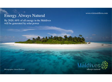
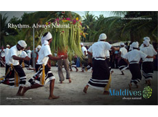
The Maldives Marketing and PR Corporation (MMPRC) has released a series of mock-up billboards displaying the country’s ‘Always Natural’ branding in the context of how it would appear to potential visitors.
The new logo and slogan, designed by Thailand-based global tourism consultancy QUO Keen to replace the 11 year-old slogan ‘The sunny side of life’, was unveiled last week by the MMPRC.
In an accompanying statement, the MMPRC said it had worked “in close collaboration with Minister of Tourism Arts and Culture, Dr Mariyam Zulfa, the Maldives Association of Tourism Industry (MATI) and Maldives Association of Travel Agents (MATATO). “
 “Each stakeholder provided invaluable advice, input and contribution to the new slogan and logo,” the statement read. After a “year-long consultation, research and design process, involving industry and government”, and consultation with “dozens of tourism and other industry stakeholders, as well as the general public”, the new branding was approved by Cabinet on Tuesday.
In March, the MMPRC announced a public competition, calling for submissions focusing on the “unique selling points” and the “emotional selling points” of the Maldives, “based on a fundamental truth”. Despite the many submissions and an extension of the deadline, the stakeholder committee eventually opted to tender for a professional consultancy.
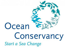
The new branding, including the slogan and a fingerprint logo consisting of islands, corals, turtles, sharks and herons that transitions from blue to green, was met with mixed reviews this week with some people drawing comparisons to the logo of Washington-based environmental advocacy group, Ocean Conservancy.

In response to the concerns, the MMPRC received legal advice from trademark lawyers Ananda Intellectual Property Limited (AIP), which noted that while there was a “very weak degree of graphic similarity between the two devices”, such graphic similarity “is in our opinion not such to create a risk confusion and there is no risk of legal objection due to such graphic similarity.”
“The size and composition of the device are very different from a trademark law point of view. The size and shape of the two devices are different. The [Maldives branding] is more detailed and in its composition. In particular the oval shape, the number of lines of fishes and the variety of fish species are very distinctive and different features and overall produces a strong graphic difference and impression between the marks. Last but not least, one device is hollow, one is not,” the legal advice read.
 “We do not consider that the degree of similarity of the marks is such that the usage and protection strategy of a country brand such as [the Maldives branding] would conflict with the mark [of Ocean Conservancy].”
At the launch this week, State Minister for Tourism, Thoyyib Mohamed Waheed, explained that the new branding would broaden the Maldives’ brand away from just tourism, making it more relevant for attracting investment in industries such as energy and fisheries, as well as allowing cross-marketing opportunities on Maldivian exports such as tuna.
Download the full size billboards


These look stunning. I didn't much like the slogan before but I see what MMPRC is doing now. Much more relevant than sunny side...
Looks very attractive and a positive message. Got to be good for the global overseas audience!
This is truly bullshit.
Love the ALL YOURS = the tourism one of the beach and the tree best! See downloads......
Love the one with small child on, great to see the use of real Maldivians. Also the one of the beach let's really show off our country to the rest of the world.
When you consider that the diving market is getting less because of the Euro zone and China is rocketing, this could be a good move.
The poster for diving and snorkeling "Colours" is strong.
"Sunny side of life" looks like a dated ad for a camping holiday in Spain now.
Not the best in the world, but 10 times better than what we had I suppose. Yeah, it grows on you.
An improvement, as long as they don't forget about the tourism sector!!
The island concept is boring.
this whole strategy of trying to tie tourism branding along with investment and carbon neutrality is a seriously bad move! i don't know why MNPRC is trying to do this.
We don't need to bring everything under one umbrella.
The logo looks too corporate and conservative. these slides still does not prove the point this is the right decision.
it does not excite. its too neutral and seriously misses that "X" factor. it does not relate at all to the standard, quality and the vibrance of the tourism industry in Maldives.
MNPRC has failed miserably in overall strategic thinking and creative ability.
Poor layout! presentations look real cheap.
The one with the smiling girl is the best. Give people a year and these will grow on them
The more i see this logo, the more cheap its becoming.
it is bland, dull, uninspiring, boring and spineless.
we could have done a million times better.
these mocks up does not live upto the tourism industry we have here in the Maldives.
Let tourism logo be for tourism. theres already a logo for investment (http://www.investmaldives.org/)
poor strategic thinking and foresight by a clueless MD at MNPRC.
I think these are brilliant. For the first time I can see our country being presented as more than just pretty beaches
Among other things, Maldives have an old culture and a unique language - things that should differentiate Maldives but not reflected in the logo. 'always naural' is too simple for Maldives.
summary: the idea of ministry of tourism arts and culture is not reflected by 'always natural' logo
well done mmprc . the sunny side of life was a rip off from thailand pls check:
https://www.facebook.com/photo.php?v=10150336810521174
The committee here was trying to be all things for everyone... Not easy. Don,t think the MD can be singled out. Big improvement, like the beach scene best... See downloads
sorry check
https://www.facebook.com/photo.php?v=10150336810521174&set=vb.603246173&type=2&theater
Ahmed... The invest Maldives logo is quite good. But wud it make me cancel my booking to the Carribean for the Maldives....? No. It is too corporate and meaningless for that leisure market.
People come here for the natural pristine beauty.... This logo connects to that point. Should help the dive market and safari boats too I'm guessing.... I bet they love it
nice to see fake comments being published in various names.. with not so great english.. gee simon.. isnt that a tad too much...? isthiufaa!.
Thoyyib, you have to accept this time you have done a blunder period. Rather than beating the bush
100,000 Dollars for this ? what a load of crap. Im a graphic designer and i could have done 10 of these logo's for even 1000 dollars.
Onwards and upwards. New era. Aneh Dhivehi Raaje.
No doubt that fact that certain people missed out on the $100,000 is the real reason they're angry.
the logo is great when in use, so we might need not start a rebel movement against the logo now...
except color n smile slide the rest is really BULLSHIT, eg. what so natural in ISLAND INVESTMENT.i'm pretty sure the guy made this really doesn't know what he is trying to tell.
What is becoming more typical is women in black.. photos of batwomen could have been one photo of always natural..
11 Reasons Why New ‘Slogan’ & ‘ Logo’ doesn’t work
1. Failure to Deliver
New logo fails to position/ deliver in underscoring as targeted to
all market segments on the main reasons for visiting
Maldives - which clearly is 'sun, sea, sand'.
2. Failure in Positioning/ Target
With over 70% of visitors to Maldives been honeymooners, couples
and Maldives seen as romantic luxury destination, thus cliental of
‘Marks & Spencer’ (50+ mid-market) isn’t our target audience but
rather more like ‘Harrods’
3. Failure to create unique Identity
As the logo apparently is in coincidence similar to logo’s used by
NGOs promoting bio diversity or Ocean Conservancy. This shows
ad agency failed to create anything unique or have done poor
homework to find too many coincidences
4. Poor research and study
If over years research was done for this logo, the researchers
should know that ‘Sea horses’ are very rare in Maldives to give so
much prominence to this as this isn’t a logo for a Disney cartoon.
5. No clarity and is confusing
It is difficult for a newbie for Maldives to identity the symbols in the
logo, and from far it just looks like a thumb print which doesn’t have
any relation to Maldives and creates confusion
6. No values or personality
As the brand personality is confusing by trying to target tourism,
fisheries, agriculture, construction and other industries; thereby
no values to cherish or aspire to create any attitude.
7. Unrealistic slogan
How natural is Maldives? We have major projects like Hulhumale,
Gulhifalhu, Thilafushi; which creates major problems for
environment and also how many resorts destroy the natural beaches.
8. Might create copyright issues
‘Always Natural’ is a trademark of major health products company
and Ocean Conservancy might create problems for copying
logo designs as well.
9. Wrong brand direction and growth
‘Always Natural’ is already seen by many talking about a health
product and doesn’t communicate 2/3 of our objective which should
be ‘Tourism’, as Maldives economy depends 2/3 of this. And even
tourists would think this brand is associated with nudism or to promote
it.
10. Public opinion and my brand
The present internet social media outcry, with opinions on local TV,
newspaper; explains that what the CEO of QUO KEEN wanted
‘created a brand that stands for the Maldivian people,’ has clearly
failed as Maldivian aren’t proud of it nor it stands for us.
11. Was the old logo or slogan broken
Nike ‘Just Do it’ is classic example that branding doesn’t require
fixing unless it is broken. Was enough research done to study
whether old logo was out dated or broken. Above points concludes
otherwise.
why the small girl in the photo - are u encouraging sex tourism
the logo is unimaginative and ordinary compared to a logo like 'incredible india'
@Mo
Even if we had a cat as our tourism logo with Meoww as the tagline, i dont think people would still stop coming to the maldives and divert elsewhere.
you are missing the point. tourism ministry created a separate company "MMPRC" which stands for "Maldives Marketing & Public Relations Corporation" with all its glory to take over the all the marketing and PR effort of this nation.
With a totally underqualified Managing Director - Simon Hawkins at its helm attempts to come up with a new logo and slogan for the Maldives tourism.
An MD without any experience (least to say in advertising, marketing or PR) delivers seriously substandard product which even maldivian advertising firm could have done 100% better.
Do you still think we should just give this all a clean break and say ok thats what happened this time, its simon's first time. will do better after 10 years when we change the logo.
HELL NO MO!
@reena
$100,000 is actually a very cheap cut for a change of logo and slogan of a country's tourism campaign.
Quo - the company put in charge would have made more money out of smaller projects.
So, obviously, there attention and effort would reflect on the price. I wouldnt blame them.
I would blame MMPRC firstly, to start meddling with the existing logo and tagline when they knew they didnt have enough budget.
If they had given the $100K to a Maldivian ad firm, im pretty sure, the outcome and process would have been much more worthwhile! no doubt.
Because the sunny side of life was too created by Maldivians and at that time, it did fit the bill and it had a good run
BUT THIS POOR EXCUSE OF A BRANDING - does not reflect the times, does not appeal artistically, its just a real cheap shot at the whole process mismanaged by MMPRC.
@Ana
You sound like you were close to the process. and i get it.
BUT you must know
A well executed product with good leadership does not necessarily try to make everyone happy.
I think with Simon's relative inexperience and fact that he is new to a job of this caliber, i think he did not want to disappoint anyone or had the guts to say what needed to be said.
And in the end, the system got to MMPRC and the corporation lost focus of what it was supposed to do!
i think thats what happened!
I call for more a more competent person to be appointed MD of MMPRC.
This Simon Hawkins is obviously not the right person for the job.
God knows whatelse he will do.
i dont get all the fuss in this. its just a logo. and its not bad looking. its ok. and it worth 100000$, whats not worth is Maldives wasting there energy on this petty issue while ur parliament MPs will run away with an additional 20 K each for the rest of ur life and ur grand children s too, your judiciary and its judges to rip u all off for life, ur government macroeconomic policies making you poorer everyday and u all are just lazy morons limited to facebook and media commenting.
These billboards we not planned previously nor are these part of the initial launch strategy. These were just done after some hasty meetings following the recent comments and criticism from the public. These are just some quickly produces armature images in an attempt to show the public that they had big plan for this. Simon Hawkins mentioned on Thursday to a resort marketing person that he will make sure Maldivians soon start talking good about this whole logo issue. He also said the President has approved it so there is not turning back but to accept what they do.
At the end of the day, it is very clear why certain people feel wronged and why. You do not have to be a detective to work out who they are either.
Comment about sex tourism and child is taking the whole "say what you want and not be accountable" thing just to far.... Normal healthy minds simply do not think this way, so why say it? Hideous, a new low. I am going to read another story where decent people comment.
This logo and slogan faced fierce criticism from most of the people here on Minivan News and other websites when the first news article about this was published couple of days ago.
Looks like Minivan has taken an extra effort to create trolls and comment in their names, favourably for the logo and slogan when this article was made online.
For me, this logo and the slogan are both so sub-standard for our high standard toursim industry. They are too dull, too boring and does not represent Maldives as an attractive and must-visit tourism destination.
In addition, we may even be sued if not by Ocean Conservancy, by ordinary tourists for lying and misleading them -- we are NOT always natural. Who knows, someone might even call us all to be garrotted on the spot! 🙂
So considering everything, I think the Maldives government should not use this logo or the slogan or the billboards with these. They simply fall below our standard of excellence.
@ Paul Jacob on Sat, 29th Oct 2011 3:06 PM
"I think these are brilliant. For the first time I can see our country being presented as more than just pretty beaches"
Our country?
My foot!
Surely you cannot be talking about Maldives.
We do not have even a single Paul Jacob who is a Maldivian.
If we are counting on smiles and energy to attract tourists we maybe headed for serious trouble. It was our marine environment and beauty beaches that helped us compete and win over other destinations where people had big warm smiles.
If MMPRC has such a hard time trying to sell the new brand to Maldivians I wonder how they are going to fare in the tourist markets.
and we have people called Rolex?
@ Hmmm! on Sun, 30th Oct 2011 9:25 AM
Yes!
But Rolex is no Maldivian.
Quo Keen tried to fool Maldivians by creating a cheap copied logo
Good photographs and they do a good job at distracting you from the poor quality of the logo.
Natural smiles? A campaign against botox?
this logo is perfect. the logo is not meant to be sold for Maldivians who by nature rebel to each everything. and of all is not meant to wasted Maldives graphic designers who use pirated software and google to make a logo.
This is nothing but child exploitation by state, shame on MDP and Nasheed's administration.
http://www.iamnabeel.com/nabeel/re-branding-story
Here a Maldivian tried to explain the sensitivity of tourism branding without proper research and how similar destinations failed due to poor decisions made by authorities as we see today in the Maldives.
Simon Hawkins and Thoyyib zindhaa Baadh...
Hypocrisy. Always natural.