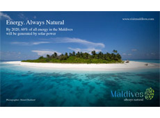
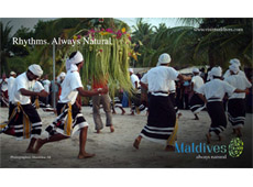
The Maldives Marketing and PR Corporation (MMPRC) has released a series of mock-up billboards displaying the country’s ‘Always Natural’ branding in the context of how it would appear to potential visitors.
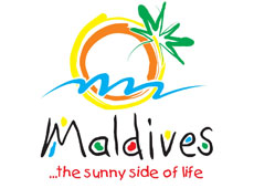
The new logo and slogan, designed by Thailand-based global tourism consultancy QUO Keen to replace the 11 year-old slogan ‘The sunny side of life’, was unveiled last week by the MMPRC.
In an accompanying statement, the MMPRC said it had worked “in close collaboration with Minister of Tourism Arts and Culture, Dr Mariyam Zulfa, the Maldives Association of Tourism Industry (MATI) and Maldives Association of Travel Agents (MATATO). “
 “Each stakeholder provided invaluable advice, input and contribution to the new slogan and logo,” the statement read. After a “year-long consultation, research and design process, involving industry and government”, and consultation with “dozens of tourism and other industry stakeholders, as well as the general public”, the new branding was approved by Cabinet on Tuesday.
In March, the MMPRC announced a public competition, calling for submissions focusing on the “unique selling points” and the “emotional selling points” of the Maldives, “based on a fundamental truth”. Despite the many submissions and an extension of the deadline, the stakeholder committee eventually opted to tender for a professional consultancy.
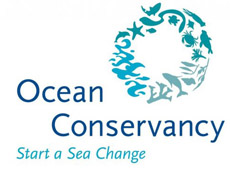
The new branding, including the slogan and a fingerprint logo consisting of islands, corals, turtles, sharks and herons that transitions from blue to green, was met with mixed reviews this week with some people drawing comparisons to the logo of Washington-based environmental advocacy group, Ocean Conservancy.

In response to the concerns, the MMPRC received legal advice from trademark lawyers Ananda Intellectual Property Limited (AIP), which noted that while there was a “very weak degree of graphic similarity between the two devices”, such graphic similarity “is in our opinion not such to create a risk confusion and there is no risk of legal objection due to such graphic similarity.”
“The size and composition of the device are very different from a trademark law point of view. The size and shape of the two devices are different. The [Maldives branding] is more detailed and in its composition. In particular the oval shape, the number of lines of fishes and the variety of fish species are very distinctive and different features and overall produces a strong graphic difference and impression between the marks. Last but not least, one device is hollow, one is not,” the legal advice read.
 “We do not consider that the degree of similarity of the marks is such that the usage and protection strategy of a country brand such as [the Maldives branding] would conflict with the mark [of Ocean Conservancy].”
At the launch this week, State Minister for Tourism, Thoyyib Mohamed Waheed, explained that the new branding would broaden the Maldives’ brand away from just tourism, making it more relevant for attracting investment in industries such as energy and fisheries, as well as allowing cross-marketing opportunities on Maldivian exports such as tuna.
Download the full size billboards
